A memory of how something or someone looks can be inaccurate, and so very stubborn. Maybe I keep that 'edited' memory for sentimental reasons, or maybe the memory is a composite of multiple exposures to or interactions with what is visualized, or maybe memories can come from first impressions. Whatever the reason, it shows up in my art. This is not to say that's a bad thing, in fact it's probably what makes every artist's work unique. This is only to say that a stubborn memory can be problematic at times.
I've been trying to paint water lilies with watercolor this week. As I've move through my varied renditions I noticed some key problems. Not in the colors, or the brush load, or the paper. They aren't even in my ability to create imagery of petals or lily pads.
You should know I have been using a reference photo... several in fact. The flowers I have been trying to represent aren't only in the misty recesses of my mind, filed with sweet memories of summer visits to the water lily ponds of Longwood Gardens, Pennsylvania. I had pictures... many many pictures. My husband and I took dozens of photos, giving cover to the other as they lay flat on the sidewalk to capture the sun illuminating the pale pink petals, or hang ten at the edge of the pool to shoot down to snap shimmery reflections of blooms atop stems skimming the surface of motionless water.
It was somewhere around the fifth iteration when I noticed my orientation was confused. The flowers had been painted as if I was peering eye level across the water at the spiky bowls of color. Meanwhile, the lily pads beside them looked like they'd been painted from overhead. Okay. Now we were getting somewhere I thought, providing the encouragement to try again.
The next was better, yet something still wasn't working. The petals seemed off kilter. After staring back and forth between my photo to my painting to my photo in vain, I walked away. When I returned with fresher eyes my expectations were revealed! I'd been anticipating the blooms to look like the lotus flower held in my mind. It was a side view, as if often seen on yoga posters or mindfulness memes. The flower in my photo was nothing at all like my automatic association with "lotus" although, by definition, they are the same flower. My perception was tilted. I'd been seeing, but not really accepting, the actual shape of the flower.
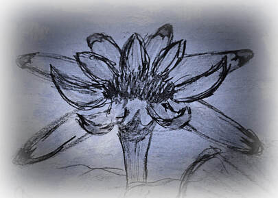
These competing images were disorienting to me and my painting. I couldn't see the flower the way it was. It was a bias, actually. Bias is usually considered as a societal issue, or a researcher's worst nightmare, but I'd never thought about it as a stumbling block in art. I took a new approach. Pulling out paper and pencil, which feel quite uncomfortable in many ways, but are much more solid and seem to require intentionality. I tried to study my photo gain, but this time with fresh perspective. Finding the shapes, proportions, and shadows, I scratched them out slowly, one petal at a time. I wanted to get to know the flower better. How are the petals related to the center? Are they all the same length? What is it's anatomy? I laughed out loud to realize what was tripping me up was me, and I continued to fill page after page with water lilies! Finally, having let go of the unconscious insistence that a water lily always looks a specific way in spite of photo evidence to the contrary, it was finally possible for me to more closely represent one on paper. It wasn't perfect or very artistic, but it's more accurate. My painting is still not 'there' yet, but it is getting closer.
Seeing first hand how my inability to represent this bloom was caused by a rigid impression was very powerful and, because I have a tendency to over think things, I wondered where else bias was influencing my perception and judgement. Maybe I don't know my own biases as well as I thought I did. How often do my perceptions masquerade as what is?
Art has a way of shining light into shadows I didn't even know were there.
bias (v.)
"giving a bias to, causing to incline to one side," 1610s literal; 1620s figurative; from bias (n.). Compare French biasier. Related: Biased; biasing. https://www.etymonline.com/word/bias
 RSS Feed